


TLDR: ASK BOSCO® lets you group related visualizations and notes to create cleaner, more structured dashboards. You can also fully customize the look of your dashboards using the new Styling Panel, including theme colours, corner styles, and visibility options for titles and descriptions. Groups and individual tiles can be moved, resized, and styled independently for complete layout control.
We’re excited to introduce two powerful enhancements to ASK BOSCO® Reporting dashboards: Grouping and Styling. These features give you far more control over how your reporting is presented, making dashboards easier to navigate, easier to interpret, and far more visually polished.
Whether you’re building a quick report or an executive-level insight hub, these help you structure your data your way.
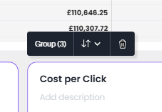
The new Dashboard Grouping feature lets you organise multiple Visualizations and Notes into neat, logical sections. Instead of a long, sprawling layout, you can now cluster related insights together, making dashboards much easier for you and your team to read and understand.
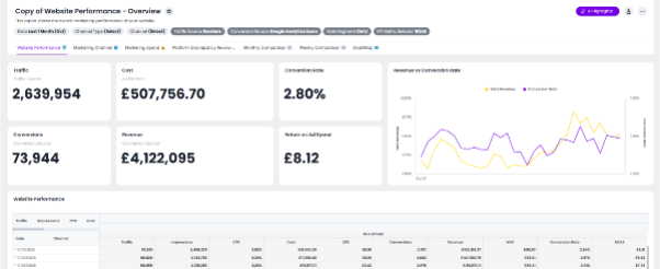
Here’s an ASK BOSCO dashboard before our new grouping feature:
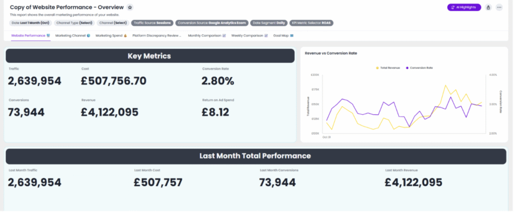
And after:
Your dashboard now has a clear, structured section to help you quickly understand what you’re looking at.
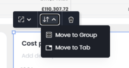
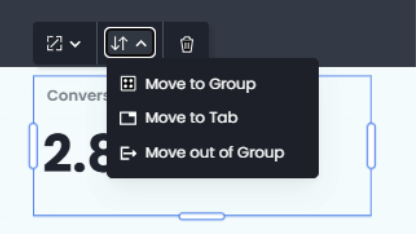
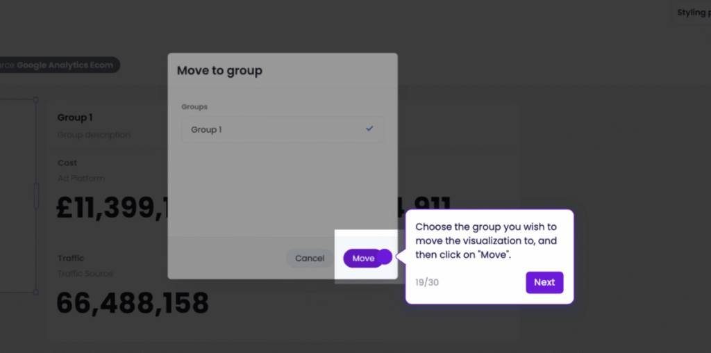
Once your group is created, you can move it or change it how you wish, including…
Groups are flexible, dynamic, and designed for fast dashboard layout management.
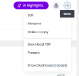
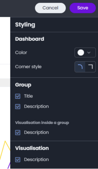
Alongside grouping, we’ve introduced a completely new Styling Panel, for improving your dashboard aesthetics and making your data easier to understand.
To access it:
Now you can customize:
Choose from a set of pre-configured colours. Your selection automatically applies to:
Prefer a modern curved look or sharp, clean edges? Toggle between curved or straight borders for every element in your report.
Turn visual clutter on or off with description toggles:
Click any single Note or Visualization to customize its appearance independently using panel options specific to that item.
Together, these styling tools give you the freedom to create dashboards that match your brand, highlight key insights, and bring a professional polish to every report.
Experience the new Grouping & Styling features in our interactive demo: https://askbosco.storylane.io/share/3hvmtadjjezr
Explore how easy it is to build beautiful, intuitive ASK BOSCO® reporting dashboards. With powerful grouping and streamlined styling controls, ASK BOSCO® now makes it easier than ever to organize insights, highlight what matters, and create reports that make an impact.