
The new chart settings experience introduces a redesigned, easier way to configure charts. All chart controls are now grouped into a single, intuitive settings panel, giving users greater control over how their data is visualised.
This new update includes:
- A clearly structured settings panel organised by chart components
- 50+ new advanced settings across chart types
- Pixel-level control over formatting, styling, and layout
- Smart inheritance so common settings apply automatically
- Basic and Advanced modes to suit different user needs
What problems / pain points does this solve?
Previously, chart customization was difficult to navigate, often required repetitive configuration, and could lead to inconsistent results. Customization options were also more limited.
This update:
- Makes chart settings easier to find and faster to use
- Reduces repetitive formatting through inheritance
- Supports both quick edits and advanced customisation
- Helps users create consistent, professional-looking charts with less effort
Examples of easier navigation
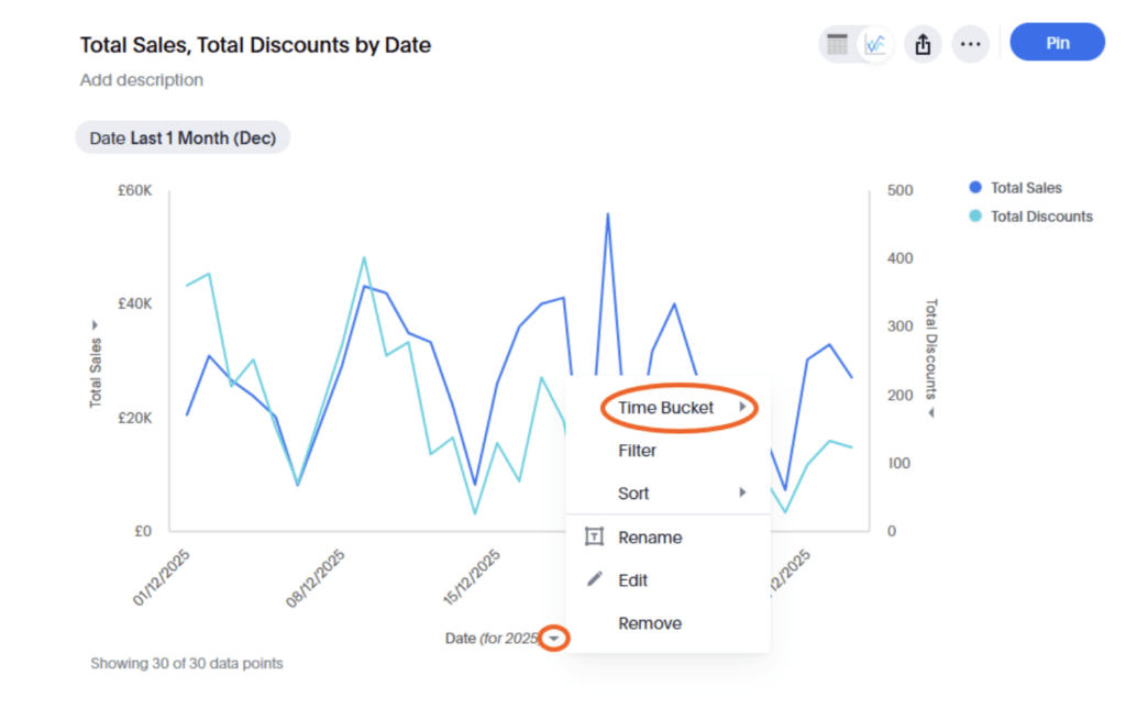
Old experience: Access options such as the axis settings individually via the axis.
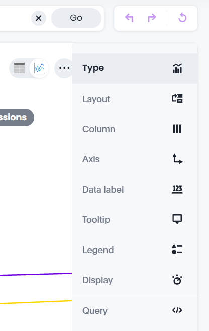
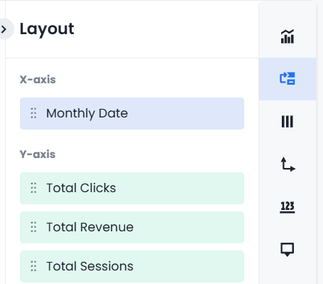
New experience: Settings for all three axes available in one menu item.
Old experience: Via the cog symbol, often multiple clicks to get to the correct menu to find options for making changes.
New experience: Navigate directly to the options to make changes to chart settings.
What are the useful aspects of the feature?
Intuitive, section-based settings
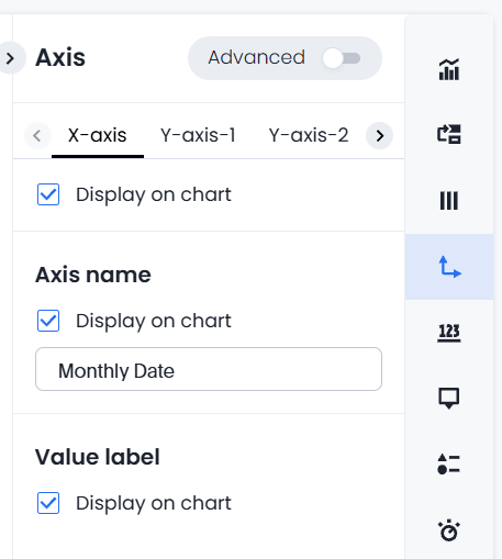
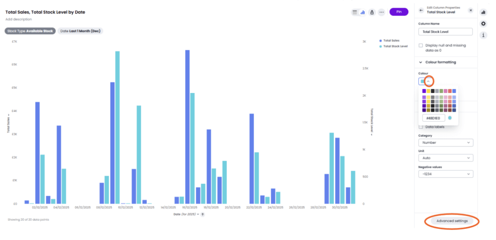
Chart settings are organised into logical sections for Type, Layout, Column, Axis, Data Label, Tooltip, Legend, Display, Query, and Custom – making configuration clearer and more discoverable.
Greater visual control
Users can precisely control:
- Fonts, colours, labels, and axes
- Tooltips, legends, and data labels
- Number, percentage, and currency formatting
- Chart layout, scaling, and display behaviour
Smart inheritance
- Common settings automatically apply across similar chart elements
Two different modes
- Basic mode keeps things simple
- Advanced mode unlocks deeper configuration
Use cases: Who does it benefit, and why?
Executives
- Cleaner, more consistent charts in reports
Analysts & power users
- Deep control without workarounds
- Greater trust and transparency in chart data
Marketers & business users
- Easy chart adjustments without technical expertise
- Presentation-ready visuals in less time
if you would like to see this new feature in more detail, why not book a call with our team?


